WEIGHTS, SERIFS, & STYLES
Brand Typography
PRIMARY TYPEFACE
The primary display typeface, MM Sharp Sans, uses the same foundation letter forms as our MassMutual mark and gives our communications a striking yet friendly feel. Because of its size, it’s best to save this typeface for headlines, subheads, pull quotes, and other large-type situations. MM Sharp Sans is also used for all consumer-facing print and out-of-home executions.
WHERE TO USE
Headlines, subheads, pull quotes, advertising, merchandise, trade show/event materials, campus branding, signage, stationery, and checks should exclusively use MM Sharp Sans. The front and back covers of print collateral, apart from lengthy disclosures, should also only use MM Sharp Sans. High-profile internal communications (i.e., CEO presentations and company-wide communications) should use MM Sharp Sans exclusively as well. Fallback fonts that approximate MM Sharp Sans have been selected for the majority of internal communication needs.


SECONDARY TYPEFACE
Lato
An open source Google Font, Lato, is a more flexible sans serif typeface based on pure geometric forms. It’s a perfect counterpart to MM Sharp Sans for smaller and longer texts. It’s also used to complement Freight in the digital space.
WHERE TO USE
This font should be used for lengthy disclosures and as needed for long-form body copy (below head/ subheads in internal or external print and digital executions), or forms.


TERTIARY TYPEFACE
MM Freight Text
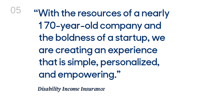
Freight is used for larger display moments and headlines to contrast both Lato and MM Sharp Sans.
WHERE TO USE
Use this font for covers, spreads, and signage. Freight should be used in display moments and headlines where noted. Freight can also be used for large quotes or titles.


Use Case Scale (Global)
FUNDAMENTALS
Typographic Dos and Don'ts

Do use headline treatments to create clear hierarchy from body text.
Do use Freight for large titles and display moments.
Do ensure enough contrast in scale when using MM Sharp Sans in headlines.

Don’t use body copy and headline treatments at the same point size.
Don’t use Freight in small attribute or eyebrow treatments.
Don’t use MM Sharp Sans in headlines at sizes and weights not clearly shown. Also, light blue on white is not ADA compliant.
Don’t use Freight in its lighter weights for any headline treatments. Choose a heavier weight.
Don’t use all-cap treatments of MM Sharp Sans in CTAs and buttons. Also ensure correct weights are used for legibility at scale.
Don’t use lighter weights of MM Sharp Sans for eyebrow and folio treatments. Smaller type sizes require heavier weights.
css style code:
Headline Fallback
font-family: 'MMSharp', 'Century Gothic', 'Futura', Tahoma, sans-serif;
Body Fallback
font-family: 'Lato', 'Century Gothic', Arial, Verdana, sans-serif;
Highlight Fallback
font-family: 'Freight', Georgia, Times, serif;
Primary/Headlines
MM Sharp
Headlines
Display
Body Copy

Century Gothic
Headlines
Display
Body Copy

Futura (alt)
Headlines
Display
Body Copy
Tahoma
Headlines
Display
Body Copy
Body Typefaces
Lato
Display
Body Copy

Arial
Body Copy

Verdana
Display
Body Copy
