The Wordmark: Meaning and Usage
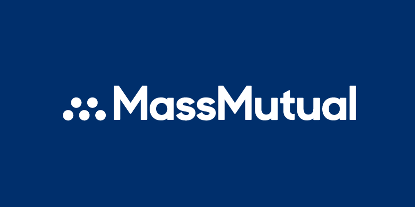
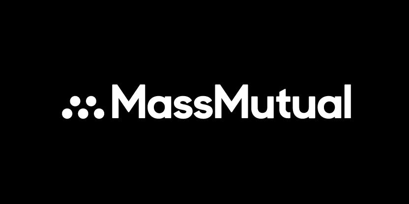
MassMutual Brand Mark
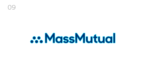
The MassMutual primary logo inspires solidarity and cooperation, expressing MassMutual as a company where people rely on others and everyone feels more protected.
The dots represent people from communities large and small coming together to secure their future and protect the people who matter most. The carefully rounded corners of the wordmark are friendly and beautiful — humanizing our company and forging connections with our audiences.
To preserve the integrity of the logo, we consider it art in its entirety and to be used only as described in this document. We must always work with the original electronic master files to ensure the highest quality reproduction and never alter or manipulate them in any way.
When vendors and third parties need to use the logo, we must supply it to them as a high resolution master file, which we have in all common graphic formats.
Logo Clearspace
To be impactful, our logo needs clear space that no other element (explicit or implicit) can cross, no matter what the application. We use the above space guide as a minimum measure to give our logo the room it needs.
A measurement of X is equal to 1.5 times the size of the uppercase “M” and should remain as “clear space” surrounding all sides of the logo. This is inclusive of the dots “M” icon.
CORRECT USAGE
Primary Logo Usage
We must always use the provided logo artwork without modification. We choose the positive version for light backgrounds and the reverse for dark backgrounds.
In instances when the logo cannot be reproduced in color, grayscale is acceptable. When using grayscale, we still always use the positive version for light backgrounds and the reverse on dark backgrounds. We should only use the logo over imagery if it can be visually clear by avoiding overly contrasted and busy images.

DO NOT MAKE THESE MISTAKES
Incorrect Logo Usage
Limitations on the way we employ the MassMutual logo will preserve the strength and integrity of the brand. These are a few examples of potential misuses. Remember, the logo is carefully rendered artwork, and we must never alter it in any way.

Do not rescale the logo elements individually. The logo must remain intact.
Do not layer the logo elements. The logo must remain intact.
Do not rescale the individual logo dots. The logo must remain consistent in size.
This does not maintain the proper clearspace around the logo. Keep a 1.5x the height of the M as a margin around all sides of the logo.
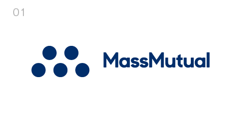
This is not an approved color for the logo. On white the logo should appear as our hero 294. Other approved colors are white or black.
Do not apply fades or gradients to the logo. The logo must remain solid.
Do not skew the logo elements. The logo must remain proportional to the original design.
Do not break apart and/or stack the logo elements.
Do not apply outines to the logo art. The logo must remain a solid approved color.
Mnemonic Animation
Similar to the logo, the MassMutual mnemonic inspires cooperation and mutuality. The animated dots of the mnemonic represent all different kinds of people coming together from various places and uniting together to form the “M” icon.
The MassMutual mark always appears in frame for long enough so that it can be fully read and comprehended before the five dots animate on screen. Where possible, the mnemonic animation should have no other elements (supers, services line, or other branding) competing for attention at the same time. We limit the amount of movement by ensuring every element of the end card appears at once before the “M” icon animation begins.
The mnemonic animation always includes both the “M” icon and mark together — never just the “M” icon alone. As an extension of the logo, the mnemonic must follow all logo rules accordingly.
Responsive Logos

M Icon

Striking, modern, warm, and meaningful — five dots form an abstract “M” letterform, creating a bold way to communicate our company’s identity. We call these dots the “M” icon.
To establish equity in the mark, we use the “M” icon as part of the full primary MassMutual logo whenever possible. However, there may be exceptions. The “M” icon can stand alone in app icons, favicons, promotional items, or other instances when it becomes impossible to use the full MassMutual logo due to size, design, or legibility issues. In these instances, we ensure that the MassMutual mark or, at the very minimum, a typographic mention of MassMutual appears somewhere on the same piece of communication.
The “M” icon follows the same color, format, and effects usage rules as the primary logo.
Special use cases are subject to approval by the MassMutual Brand Team prior to the production of any materials. Please contact brandmanagement@MassMutual.com directly.

Observing this clear space guide will uphold the strength of our icon by protecting it from competing and distracting elements or borders. A measurement equal to two dot widths should remain as “clear space” surrounding all sides of the “M” Icon at all times.
Firms' Approach to Branding
Firms may approach their branding in one of the three following ways:
MassMutual-Branded

Fully-branded MassMutual logos are geographic variations of the MassMutual logo. Marketplace consistency and the increasing frequency of the same impression will lead to greater brand awareness in the minds of consumers. MassMutual-branded firm logos share the same usage requirements of the MassMutual logo.

MassMutual-branded firms are designed within our visual identity and should consistently reflect MassMutual branding in all media.
Co-Branded Partners

MassMutual co-branded logos are lockups of the firm’s DBA logo, and a descriptor line of “a MassMutual firm,” which — to highlight the deep partnership between the MassMutual brand and the firm brand — is presented in MM Sharp Sans Bold. This is the same typography used in the MassMutual logo.

MassMutual co-branded firms are designed within our visual identity and should consistently reflect MassMutual branding in all media.
DBA-Branded

DBA-branded firms leverage the brand equity of its DBA name and identity in their local market. The MassMutual brand should not be represented in DBA firm’s media.
Note: DBA logos should not be used to replace MassMutual logos on collateral.

DBA-branded firms are designed within the firm’s identity and should consistently reflect their branding. The MassMutual brand will not be represented in DBA firm’s media.