MassMutual Color Palette
MM
Blue
#002E6BRGB 0∙46∙107
CMYK 100∙90∙30∙20
PMS 294 C
White
#FFFFFFRGB 255∙255∙255
CMYK 0∙0∙0∙0
MM
Light Blue
#4DC7EBRGB 77∙199∙235
CMYK 59∙0∙4∙0
PMS 305 C
MM
Dark Blue
#001735RGB 0∙23∙53
CMYK 97∙85∙46∙61
PMS 289
MM
Charge Blue
#0265FFRGB 2∙101∙255
CMYK 91∙53∙0∙0
PMS 285
MM Peacock
Blue (MM.com)
#004DB2RGB 0∙77∙178
CMYK 95∙77∙0∙0
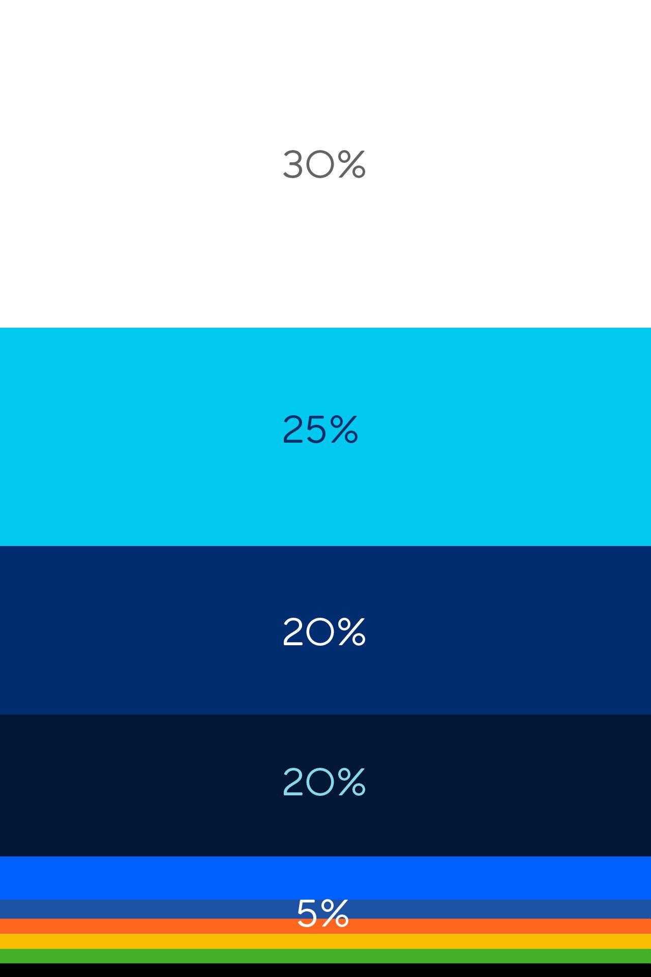
With our new corporate color system, we are exchanging the perception of a one dimensional, static, flat “blue” company for a dynamic expression of a more forward-looking MassMutual.
The palette is bright, bold, and succinct. To help us feel fresh and modern, we keep things light, making use of negative space while using additional color as an accent.
Secondary Color Palette
MM
Green
#43B02ARGB 67∙176∙42
CMYK 74∙3∙100∙0
PMS 361 C
MM
Yellow
#F6BE00RGB 246∙190∙0
CMYK 4∙25∙100∙0
PMS 7408 C
MM
Orange
#FF671FRGB 255∙103∙31
CMYK 0∙74∙96∙0
PMS 165 C

